Pre-thesis weekly reflection
Week 1 — data viz reference
Due to this pandemic, checking out some websites where provides latest health information becomes my everyday routine. I found nearly every website includes interactive data visualization for presenting COVID data, which I found very fascinating. After that, I start gathering information about technology of interactive data visualization and some websites for reference.
On the technical side, there’re several ways to make data visualized but overall I divide them into two categories, software application and programming. Among all these software, Tableau is the most popular one because it provides user-friendly UI, so user can control the presentation easily with drag and drop. Moreover, it provides storytelling board with interactive function, which help presenter articulate their idea and catch listeners attention. I tried Tableau and its UI are really amazing, yet it has limitation unless you pay for the functions. The biggest problem is no custom visual imports and custom formatting, which happens to almost every data viz tool. To get more creative possibility, I started learning programming tools for website like D3.js this recently.
After learning web development and D3.js basic knowledge on Lynda.com, I realized it’s more possibility and creativity space for people visualize the data on the Web with various kind of JS libraries such as P5.js, Node.js, vue.js and react.js. It’s more like how I want to show data in the future, possibility and creativity, instead of traditional charts and error bars. Here’re some data viz websites that I really like:
Worldshapin
It imports data and indicators from the Human Development Report 2011 published by the United Nations Development. It uses interactive timeline and selective box for country which make user easily understand the difference between countries throughout the time.
Knight lab
This lab creates many useful JS plugin tools for storytelling such as timeline and storymap.
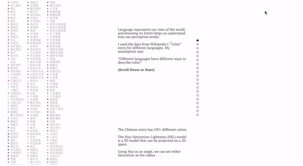
NY times
This visualization is dope for sure! It creates moving 3D object when user browsing down the website which perfectly fit the concept of climbing. NY times’s data visualization never disappointed the readers.
What I struggle the most is what is my topic for my visualization? I have passion in data viz but I don’t have main concept like first and second example above. To find out what topic that is suitable for data viz and interesting as well, I’ll use mind map and gather more information this week, trying to narrow now my idea. Anyway, during this learning progress, I found interaction is the most fascinating part of data visualization for me, since a simple chart is understandable but an interactive chart is vivid just like the graphics are showing the meaning behind the data. Thus, I’d like stick to data viz and explore interesting topic and go for it in this semester.
Week 2 — narrow down my topic
To know what kind of interactive website I’m interested the most, I browsed great amount of websites with data visualization this week. I found “scrolling” plays an important part in interactive web design because most of users are using their touch pad or mouse to control the interface rather than dragging the gray bar on the right. It’s fascinating and incredibly flexible at the same time. This behavior inspires me why not to focus on this kind of website and learn how to build them on my own. After reading some articles online, I found a new term when web developers tell stories with scrolling behavior, Scorllytelling.
Scrollytelling
- What is scrollytelling?
“Scrollytelling” is when content (e.g., a graphic) is revealed or changed as the user scrolls. It’s a data visualization tool mainly based on website or smartphone app with graphical and interactive design. Obviously, this word is a combination of scroll and storytelling, which means we’re able to use scrolling behavior to control what and how to present your story.
- Types of scrollytelling
- Scroll As Steps
This category is suitable when user presents discontinuous data like stages, classes and chapters.
2. Continuous Scrolling
It’s suitable for continuous data like time, distance and size.
3. Scroll As A Trigger
It’s nice when you’d like to present data with threshold or activation.
- Reference
If the moon were only 1 pixel
This project is my favorite so far! The topic is clear and intuitive even though the author didn’t put much description on the site. It uses scrolling times as a travel distance so when user scrolls all the way down it’ll just like you’re travelling in the solar system. I’d say this author spends some time on the research of each planet’s size, relative distance and color. It educates readers what’s solar system looks like in a fun way. Really an amazing work!
Driven by data
This site is run by Gregor Aisch, an editor in NY Times. It’s not surprising that this creator makes several awesome data viz project because many NY Times data visualization designs are created by his hands. Without a doubt, he’s expertise in data visualization, and many of his works are presented by scrollytelling. It’s worthy to take a look!
Finding Topic
- Brainstorming
- Some ideas…
Psychology theories(priority )
- visual pathway
2. development of infant perception
3. dementia stages
4. ecological psychology
Data analysis(not consider now)
- NY population and languages
- tested and death of the world for COVID-19
- average rent/house priced in different NYC districts
Research by Art &\Or Design:
I want to learn interactive website through my thesis process and build an completed scrollytelling website at the end because I’d like to become data visualization engineer in the future. So I believe my thesis would be categorized in Research by Art &\Or Design that focuses on web-based data viz tool among three research methods.
Some feedback from Ahmed:
reference
https://www.deeptimewalk.org/
https://en.wikipedia.org/wiki/Ecological_psychology
https://www.questia.com/library/psychology/other-types-of-psychology/ecological-psychology
https://www.nfb.ca/interactive/
https://www.nfb.ca/interactive/kabul_portraits_en/
https://www.nfb.ca/interactive/motto/
http://playspent.org/
Some questions:
What’s readers’ motivation of browsing the site? what’s my motivation to build the site? What does my site educate my reader? Why I use scrollytelling to make psychological content? what’s my problem statement?
Week 3- presentation and feedback
Presentation #1
This week I still finding some awesome interactive website and trying to broaden my topic because I feel I’m limited to psychology issue but can’t find a certain thing I’m interested in. So I did a mind map. I found scale is really important element when you start building a scrollytelling website. As a result, I came up some ideas for scale like Time, Temperature, Distance, Size, Money, Stages, Chapters. Based on these, I keep growing the tree and found two interesting topics for time and money.
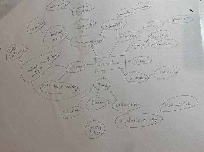
What can I buy in 1 dollar?
This idea is inspired by my grandmother, because when it comes to money, she never say “cheap” and always like “Expensive! expensive.. Back in the day, it only cost…” I know it’s about inflation but it’s hard to imagine the currency changes gradually and eventually becomes a huge difference. So why not to visualize it? That’s how I come up with topic’s name, What can I buy for $1?
After that, I quickly check out some reference about inflation in American history, and then I found CPI inflation calculator. It provides an overall report of US inflation history with some visualization like charts and graphic. This gives me an idea that I can build my project based on these information.
In short, I’d like to build a website that present the history of $1 ‘s value since 1635 to 2020 with visualization for people who enjoy learning and traveling back to American’s past through the values of 1 dollar. The screen shot is from CPI calculator. You can see that it shows how much a dollar worth in history. With this website, it’ll more accessible and understandable to learn inflation with interactive visualization design.
How do we lie?
This idea is derivative from last week’s discussion. I found lying behavior is a hot topic in evolutionary psychology because lie is proved to increase the opportunity of human reproduction and social status in evolution. The article gives a clear abstract from multiple research paper about the reason why lying. Moreover, it’s interesting to know that aging has different frequency of lying.
https://www.nationalgeographic.com/magazine/2017/06/lying-hoax-false-fibs-science/
Besides, I found this book, Why We Lie: The Evolutionary Roots of Deception and the Unconscious Mind has a thorough explanation about lying behavior from evolution aspect.
Personally, I’m more interested in the first topic, but I’ll still keep follow up the information about the second topic.
Feedback
- My topic now is too specific, need to take step back
- Don’t lock on scrolling function, go study some other interactive design
- Do some research about US economy, different type of data visualization, and UX
- Check out Apple ipod navigation document for their UX process
- Check out Edward Tufte and Richard Saul Wurman
- Some great reference of data viz:
Hans Rosling
Week 4 — responsive website
This week I explored some articles and tools for making responsive website. People highly depend on smart phones nowadays and most of the time they used their phones to browse the websites instead of computers. With responsive design, the user will stay longer on your website because it reduces the unnecessary resizes, zoom and scrolling behavior, so if I want to build a user-friendly website, responsive UI is essential. But how to make it become responsive with HTML or CSS? I found two useful tools that helps front-end developer quickly design a responsive mobile-first sites when programming.
Skeleton
Skeleton simply offers a responsive CSS package for developer who is making a small project because it gives you a template or you can call it container as well for the website’s structure. All you need to do is download the skeleton CSS package , put them in the <head>tag and build <body>with the classes template from the site. It supports responsive layout, buttons and images…etc. I think this is a very useful tools for people are learning how to build a website by them self or making a individual project like portfolio and interactive project display because Skeleton restricts the layout so you can’t make custom UI in your website design and less examples provided than Boostrap. However, it’s very easy to use and the most importantly, it’s totally free!
Boostrap
This is the most popular tools for making responsive website because it provides variety of templates like album, home page, navigation bar…almost including every component for a website. According to these features, it’s suitable for people who wants to make a decent responsive website in a short time. Just copy the code from Boostrap and decorate the layout from CSS by yourself. Personally, it’s a shortcut for building website but as a developer you don’t know why it’s responsive, don’t know the logic behind the code. Therefore, this tool will be my backup plan when making my own website.
Here’s a article that compares three popular responsive CSS tools.
Media Query
Media queries are useful when you want to modify your site or app depending on a device’s general type (such as print vs. screen) or specific characteristics and parameters (such as screen resolution or browser viewport width). Skeleton and Boostrap are both media query template. Thus, if I need to customize the display size on different device, I have to learn more about Media query and construct the responsive interface by myself.
Week 5 — UX design inspired by Apple products
According to the feedback I got from the presentation, I found some relevant articles about how Apple becomes the kingdom of digital devices and what UX plays the role in this process. Before reading the article, I know that Apple is known for the products’ industrial design such as their iconic elegant white case for Ipod, Ipad and Ipad, touch ID and Face ID, and the touching feedback. However, I didn’t expect these components are actually the keys of the success. Also, I didn’t know how much effort Apple put on design because I thought they would focus on engineer side more in order to create these innovate products. I’m inspired by the case and the history of Apple Inc and it makes me realize the development of technology is not only about engineering or materials, but also about UX and marketing. None of them can be neglect, otherwise it’s hard to become the paramount of the industry.
This article is written by Daniel Turner from MIT Technology Review, which gives a inside story of how Apple’s industrial-design brings Apple success. He mentioned how Steve Jobs makes impossible to possible. It’s inspiring that he didn’t limit his imagination due to the hardship of manufacture, but he insisted to put his model into practice no matter how hard it would be. He didn’t compromise to the technical issues; instead, he created a brand-new manufacturing process to make his product happen. That’s brave and as a CEO you have to know exactly what are you doing and why are you making this decision. This reminds me how important the executive ability and leadership are.
Besides Steve Jobs ‘s precise decision, Don Norman, who was vice president of advanced technology at Apple from 1993 to 1998, once said
“There were three evaluations required at the inception of a product idea: a marketing requirement document, an engineering requirement document, and a user-experience document,”
“The hardest part of design, especially consumer electronics,” says Norman, “is keeping features out.” Simplicity, he says, is in itself a product differentiator, and pursuing it can lead to innovation.
I believe it’s when people start to pay more attention on UX field, since UX differentiates Apple from other technology companies. Personally, I think Apple cared about users’ emotion and preference when developing their new products and that’s why Apple became popular, that is, UX brought Apple to the peak. But honestly, I have to say that the current Apple products is kind of disappointed because I don’t feel any new “human-centered” design like before. I think they innovates for the sake of innovating like they’re so focus on Iphone’s camera function and new techniques application now but I don’t feel any new experience when using the new one because they’re not useful for me. Thus, I think if Apple’s UX is able to break the current situation, then Apple might hit a peak again.
Finally, he mentioned a interesting point of view. He believes the appearance of the products will affect how users use it! It’s cool because when I’m picking a digital products such as laptop or smartphone, the first thing is the performance, and second thing is the appearance design. And I think that’s why so many students in design school are using Mac. This psychological effect is related to marketing strategies and human nature, since Apple creates a high-end image and everyone loves beautiful things and feels special. Thus, appearance is crucial, so as the functions!
“Attractive things work better,” “Studies tie attractive design to positive attitude,”
2010 Steve Jobs interview
In the video clip below, we learn that, ironically, Apple had the iPad before they had the iPhone but Steve felt the user experience methods designed for the tablet would be perfect for a phone. This shows he was a remarkably determined entrepreneur and very familiar with UX of digital devices. This is how he succeeded.
Week 6 UX lesson notes and Proxemic
UX tools and methods
- identify your audience and their need
- talk with stakeholders
- prototypes(marvel) and wireframes:https://marvelapp.com/
- Test early and often!!!(not need a finished product to test )
UX research(cheat sheet:https://www.nngroup.com/articles/ux-research-cheat-sheet/)
- interview
- JM
- Diary studies: give them task over the time and record it
- Surveys
Testing(5 ppl)
- usability studies
- prototype testing
- accessibility testing
- you’re testing product not the users!!
Accessibility
- significant minority
- 1/5 adults in US has a disability
- to include every potential user
- assistive technologies helps them access websites and digital content
- UX goal to ensure that our website can be used with these tech
- principles of accessibility: Web content Accessibility Guidelines 2.0(WCAG 2.0):Perceivable/Operable/Understandable/Robust<<relevant to HTML semantic structure
- How to recover from the error issue!!
Testing tools!!!
General Automated Testing
- WAVE extension for Chrome and Firefox
- Accessibility Viewer (aViewer — Windows only)
Readability and Plan Language
Keyboard and Screen Reader Testing
- NVDA and Firefox (Windows) OR Voiceover and Safari (built-in on Mac)
- Keyboard only testing
NYU
- https://www.nyu.edu/life/information-technology/help-and-service-status/accessibility.html
- PDF:https://www.nyu.edu/life/information-technology/help-and-service-status/accessibility.html
- Duque (company for accessibility test )
Proxemics
Proxemics is the study of human use of space and the effects that population density has on behaviour, communication, and social interaction.
Reference
http://bear71.nfb.ca/#/bear71
https://bubble.nfb.ca/
https://www.arte.tv/sites/webproductions/en/very-very-short/
https://www.experienceparliament.ca/web/#/chapters
Week 7 — The data storytelling workbook
Ch1 A Narrative Approach to Data Storytelling
- Before starting storytelling, we should think first about audience. How do they think/do/feel? what key messages does they receive?
No story lives unless someone wants to listen — J.K. Rowling
2. Narrative in Data Storytelling, how to tell a good story with data?
- types of your story? who’s the characters(event/person/place)? what’s the backstory? what’s conflict? show the details!
Ch3 Visual Data Storytelling
- templates can limit creative potential and opportunities for innovative data exploration and storytelling, which leads people seeing the data point but not connecting with the subject of data.
- Understanding the context, backstory or potential biases of the data is important for adding meaning. It will makes your story more holistic.
- Data Viz can lead to richer understanding of the data.
Challenges for data Viz
- exclusivity: ppl feel excluded from data viz because they think it has too many prerequired skills
- sanitisation and impersonalisation: using template makes data viz looks aloof.
- inability to capture complex personhood: ppl change all the time so it’s hard for data viz presenting the complexity in reality.
Guide to structuring data
Before visualize the data, you should transform it into something more structured. Earlier the better.
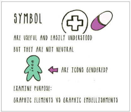
Semiotics( the meaning behind symbols)
- Rose illustration by Loki Ba from the Noun Project
- semiotics can help us better anticipate what encode into visualization, by helping us reflect on the different layers of meaning that the decoder may see.
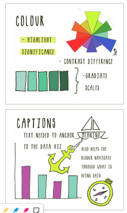
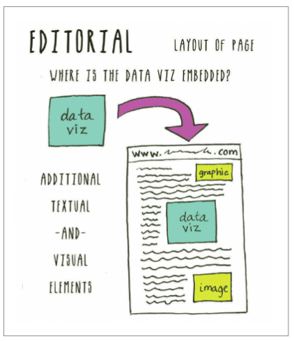
4 Pillars for Data Storytelling: symbol, color, editorial, captions
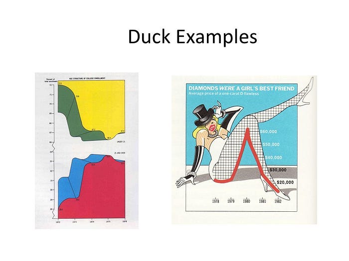
Chartjunk: unnecessary or confusing visual elements in charts and graphs.
- unintentional optical art
- the dread grid
- the self-promoting graphical duck
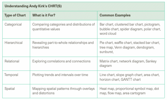
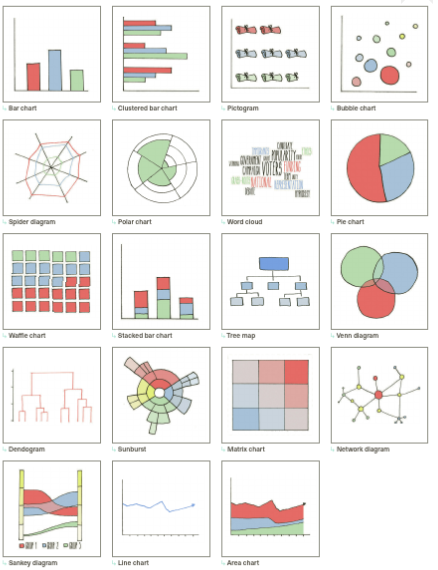
**Andy Kirk’s CHART principle:
**Andy Kirks “How to visualize Null and Zero”
- might be number 0
- might be not available, 0 doesn’t exist , Null
- blank space for visualizaiton
Multisensory Data storytelling(not only depend on vision)
- Kate McLean’s smellmaps: https://sensorymaps.com/
- Dialogue in the dark:https://en.wikipedia.org/wiki/Dialogue_in_the_Dark
- Moritz Stefaner & Sussanne Jascheko’s Data Cuisine: http://data-cuisine.net/
- Graphic medicine:https://www.graphicmedicine.org/
Week 8 — Proxemics studies
Edward Hall’s research
This week I focus on proxemics study and its definition. So what is proxemics? It’s a term created by Edward Hall, an American anthropologist and cross-cultural researcher. He defined the term” the interrelated observations and theories of humans use of space as a specialized elaboration of culture”. Which means how humans manage the space around them and it’s different from culture to culture. Basically, it’s a study of space. Edward Hall also gave us eight different “dimensions” to analyze proxemics behavior. Including posture and sex identifiers, the orientation between each other, the way we move and touch each other, visual contact, our temperature, smell and sound. Combine These eight indicators will conclude a specific behavior in our life.
Also, He was famous for this interpersonal distance study. He described the interpersonal distances of man (the relative distances between people) in four distinct zones: (1) intimate space, reserved for those we are closest to (2) personal space, for our close friend (3) social space, our preferred proximity to acquaintances and (4) public space for public speaking.
Other proxemics application
Information visualization and Proxemics: design opportunities and empirical findings— Jakobsen et al. (2013)
This research discusses how visualizations should be designed for non-desktop settings, in particular for large high-resolution displays rather than laptop setting. It’s a Human-Computer interaction research to investigate what’s the best distance and layout between human and large-size digital display.
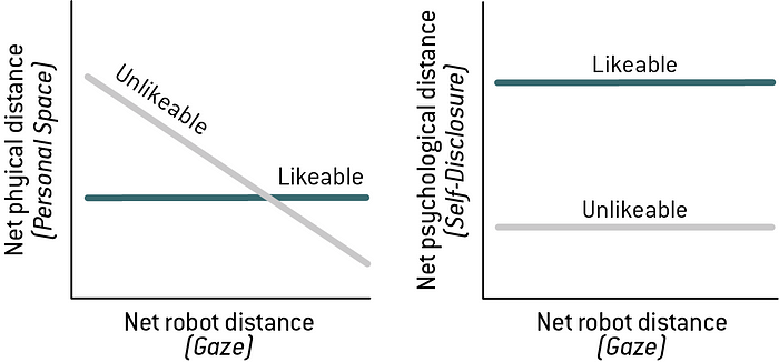
Human-robot proxemics: Physical and psychological distancing in human-robot interaction — Mumm & Mutlu(2011)
The results on physical distancing showed that participants who disliked the robot compensated for the increase in the robot’s gaze by maintaining a greater physical distance from the robot, while participants who liked the robot did not differ in their distancing from the robot across gaze conditions. The results on psychological distancing suggest that those who disliked the robot also disclosed less to the robot.
Week 9— Presentation
Reference
- Rosling, H. (2019). Factfulness. Flammarion.
- Muller, J. Z. (2018). The tyranny of metrics. Princeton University Press.
- https://fivethirtyeight.com/tag/data-visualization/
- http://www.ninawaisman.net/cecut/index.html
- https://www.sarahcameronsunde.com/project/36-5/
- data viz tools : plotly.js, chart.js, tableau, spotfire
Feedback
- how to get data?
- How to present the data neutrally?
- what is the story you hope to tell about proxemics, or are there open questions you hope to explore through first person experiments etc? could become research through art and design?
- how you want to incorporate motion design or stationary elements in your designs?
- how we can represent data in an unconventional manner instead of the common graphs and maps. How can we be creative with data representation?
For the first, I have two option at this point, one of which is finding open source dataset online, another is collecting data on my own. It highly depends on my objectives like what I what to present in final and what kind of tools I need. I haven’t make up my mind how to present my work yet so maybe I need to narrow down the topic in next few weeks just like the third question mention.
For second question, I have read this issue in The data storytelling workbook(week7). It’s hard to exclude every bias in visualization, yet understanding the background story and providing readers with the context will help this presentation more holistic.
For the last two questions, I’m thinking to build a 3D experience on website with Webgl. The user is able to feel the real distance between the avatar on the screen and they can scroll to increase or decrease the distance with the avatar.
Week 10 — Proxemics studies
“Personal Space: Exploring Human Proxemics.” , directed by Jon Silver. , produced by Dane Archer. , Berkeley Media, 1999. Alexander Street, https://video-alexanderstreet-com.proxy.library.nyu.edu/watch/personal-space-exploring-human-proxemics.
Invadee’s Reaction when invasion
- Try very hard like they are not bothered by the invasion, pretend nothing happened.
- Try to defend against the invasion perhaps by stirring the invader, to claim the space around them.
- Flee.
Only 1% of invadee talk to the invader because there’s not specific rules for personal space. Notice the invasion but choose to ignore it
Male urinal exp.
- People will tend to avoid urinal next to another guy.
- If no choice of personal space, they will adjust their body’s angel to create more personal space, more privacy.
Middlemist, R. D., Knowles, E. S., & Matter, C. F. (1976). Personal space invasions in the lavatory: suggestive evidence for arousal. Journal of personality and social psychology, 33(5), 541.
Culture difference
Contact culture, tradition, religion .
E.g. In US, if you accidentally touch others, ppl will apologize, but not in Brazil. Also, same handshake requires different intimacy in different countries.
Architectural space design: create a boundary will make people fill a specific zone , like cafe and restaurants usually have a separation design to differentiate the space’s purpose.
Next step
- schedule expert interview with Tega Brian and NYU Data Service
- Sketch my design
Week 11–1 on 1 meeting
Feedback
- My topic now is too narrow, should consider more scenarios and variables in proxemics study.
- Start conducting interview with experts
- I need to consider 3 factors in my study: demographic, situation and nature. Situations could be public transportation/post-covid/urinal
- collect data by myself
- collect data and visualize it in real-time
I think the idea is good but I have no idea how to start and whether the whole thing is what I want, so this makes me a little anxious. I’ll spend another week to speak to experts and put my ideas together. Right now if my site contains all these factors or situations, this will focus more on data management and the visualization might be regular pie charts and sliders. It’ll be a concern that how to let user feel the distance with 2D graphics or even should I create it with VR/AR?
For now, I need to simplify this idea to a more instinct and visualized way to present it. Also need to find some reference and inspiration for how to make user feel the distance .
Reference
Week 12 — Data Service interview
I held a informal interview with NYU Data Service’s specialist to see whether he could give me some suggestions for data-viz tools that NYU provided. If I’d like to combine survey and visualization, Qualtrics and Tableau could help. Users are able to embed Qualtrics survey and result in their website, but not sure if it’s real-time or not. Tableau provides dynamic data viz charts and dashboard, so I could embed these from Tableau. If I need to connect survey with it will need some coding.
https://hacks.mozilla.org/2019/01/how-to-make-vr-with-the-web-video-series/
For WebVR, I watched a few tutorial videos and found it pretty interesting because it’s not harder than I thought. I can create a VR scene from first-person perspective so users can feel the distance between the objects in VR and themselves with continuous teleport spot or mouse scrolling. However, here comes the question: how to collect data? what’s the role of proxemics? What’s the interaction and rewards in this project? I need to clarify this project’s design as well as the objectives before falling into the concern that if I’m able to use the tools.
Thus, I draw some sketches and brainstorming to see any combinations and possibilities in this project.
Week 13 — Prototypes
Prototype #1
According to the article A web-based, interactive visualization tool for social environmental survey data, the article provides a basic structure of a website with storage, management, visualization functions. I think this is quite closed to my original design but without survey function. So based on this structure, adding on a survey element to collect data, I’m going to create a data collection site with real-time data visualization. The site can be separated to two section, survey and visualization. In the first section, users have to fill in the questions about proxemics study in different situations. After users submit the answer, their answers will be appended to the database which will become the source of the second section. In the second section, data visualization, you will see a visualized dashboard to present the dataset that we collection from every survey response.
Prototype #2
The reason why I create the second prototype is because I feel a bit off when I look back on the first one. I don’t feel the excitement to create or develop it because the survey thing might not what I want to do. So in this design, I focus more on the visualization than data collection.
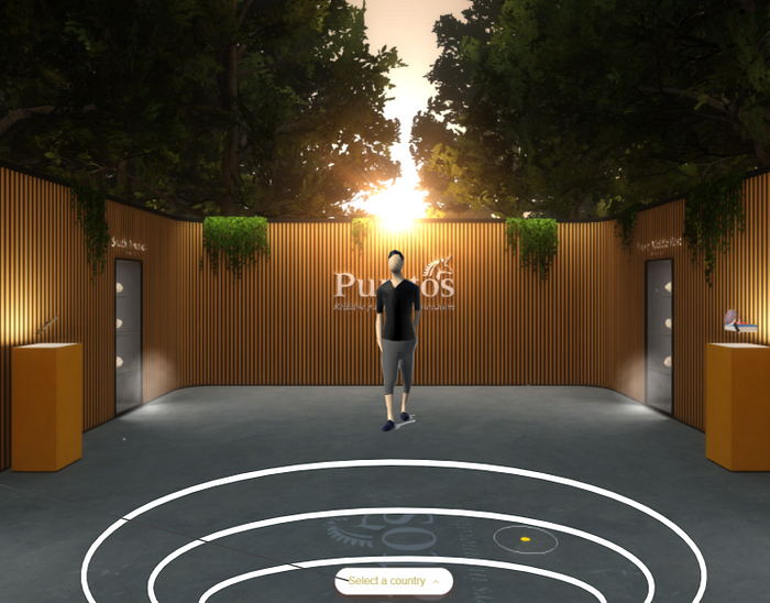
I’ll build this with webVR tool to create a 3D environment in order to make audience feel the real distance in life through the screen. Users are able to move around and interact with the virtual character. You’ll have different responds from the character depending on the distance between each other. This will be more like a game instead of a data-visualization project.
Week 14 — Final Presentation
Presentation url:
https://docs.google.com/presentation/d/1rtXJ5sNSVUx6nyblXqaBGLaAwVSwRN_eKmsQnFmzzPw/edit?usp=sharing
Feedback
Reflection
I’ve been stuck at the points of how to combine these two concept with good UX and why I feel less interest than before after I finished my prototypes. I figured out with two main reasons. First, I didn’t really figure out what I really want in this project. I’ve focused on how to gather data and how to build data-visualization, but initially I want like this project to be fun and easy to play. So it doesn’t matter which tools or media I use, but the point is creating motivation to make user interact with my design and understanding proxemics study at the same time. Second, I want everything to be presented in my project. I should narrow down or pick a specific situation as a start point, so the whole design won’t look too complicated to build. As a result, I simply my project to focus on the concept of invasion in proxemics, which means the design will explore the distance and behavior when people invade your personal space in different contexts.
Final-Protocol: https://drive.google.com/file/d/1d_nFbg_eIWBBizJvmWkC5-M5snIHrfZQ/view?usp=sharing
